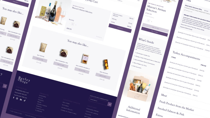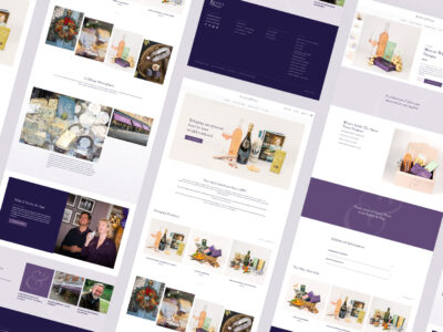
Bayley & Sage is a collection of 12+ delis and shops across London that pride themselves on quality produce from trusted suppliers. We were tasked with designing and building a new website promoting the 12+ stores in London and an e-commerce platform to sell their products online.

The two key focuses of the website design were to push online sales as a new platform while at the same time maintaining the ‘on the high street’ appeal Bayley & Sage have. This was achieved with a mixture of navigational decisions and careful consideration of hierarchy.
Our first task was to create a website design that conveyed the quality, elegance and community of the Bayley & Sage brand while keeping in mind a core e-commerce user journey. We opted for a clean, clear and minimalistic approach to the design, allowing the products/photography to do most of the heavy lifting visually.
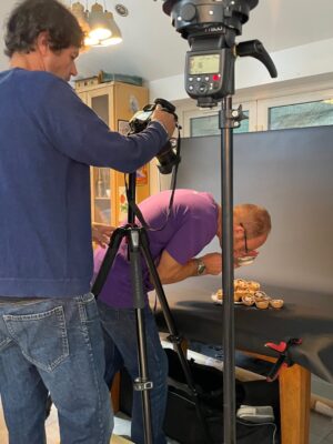
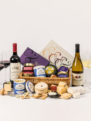
As well as producing the website design, we directed and shot many of the products for the website. We experimented with various approaches for the photographic style and decided on a less is more approach, allowing the products to sell themselves.
This led to creative decisions around how to present the products, how much of the food should be unwrapped, should drinks be poured etc. The outcome is a consistent style with harmony and elegance without an over-reliance on gimmicks or props.
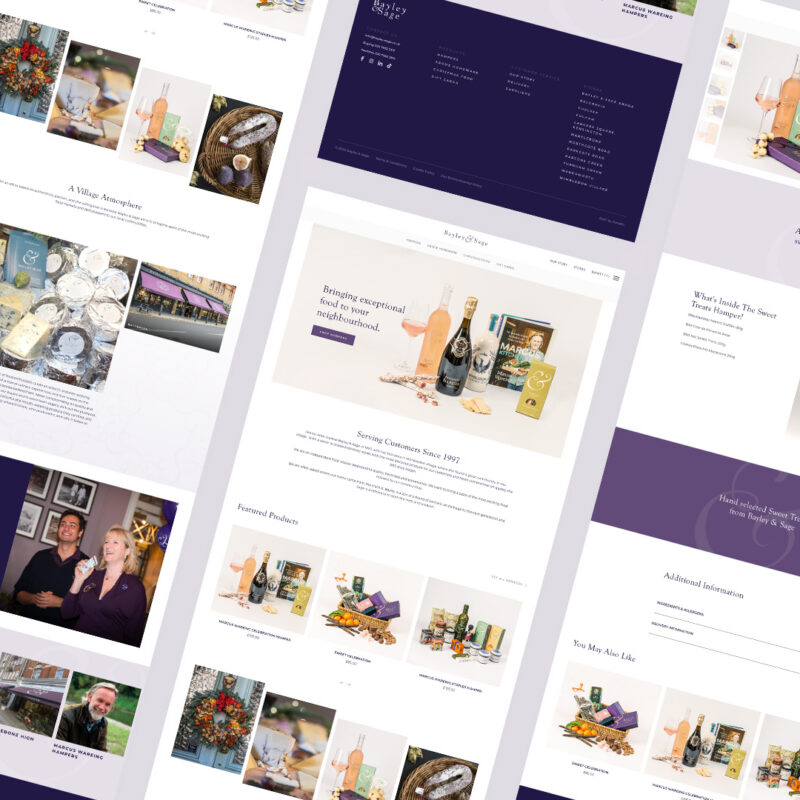
We ensured the brand and ethos of Bayley & Sage were present at every stage, whether you’re finding out about the shops or browsing products online.
We worked with Bayley & Sage to deliver an e-commerce solution which allows their customers a selection of choices based on their preferences, including click & collect, shipping or hand delivery by Bayley & Sage (if within range).
Each solution required careful planning and bespoke programming to ensure it worked for customers’ needs and Bayley & Sage’s logistical team’s requirements. The outcome is a robust e-commerce platform which gives Bayley & Sage room to expand their online offerings over time and scale accordingly.
